The first time I saw a picture of Jack Hillmer's Ludekens House, it stopped me cold. My eyes were drawn to the "diamond-sectioned truss[ ], clad in overlapping boards and floating above almost invisible supports," cantilevered out over the entry, running clear through the house, and then cantilevered out again over the bay in Belvedere. A. Hess, Forgotten Modern, 47 (Gibbs Smith, 2007). I was stunned.
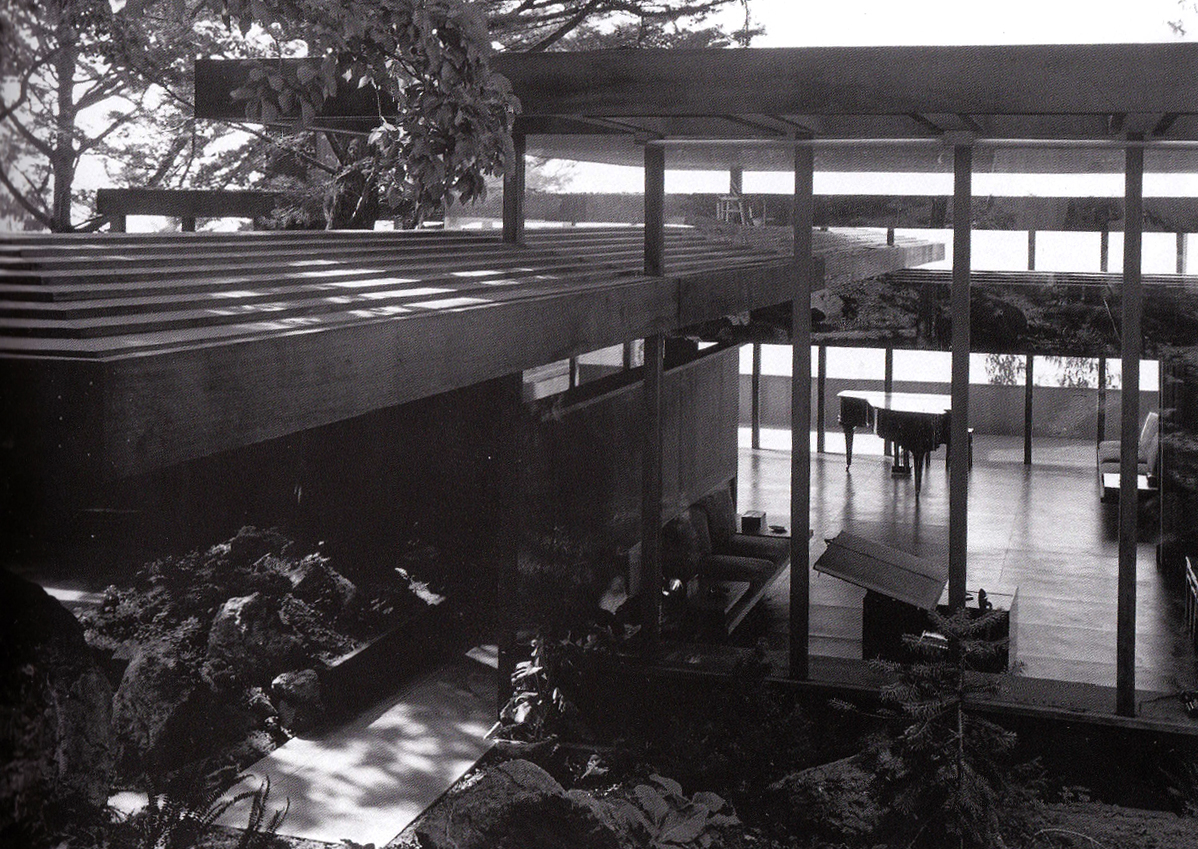
I had to know, who was Jack Hillmer, what other buildings has he designed? An initial search only revealed a couple pictures and two articles on Jack Hillmer in the SF Gate. Eventually I found several books, more pictures, plans, and even a wood model owned by the SF MoMa. See, e.g., P. Serraino, NorCalMod, 80-83 (Chronicle Books, 2006). The more I saw of the house, the more I was completely convinced that it was one of the finest houses in the county. I write "was," because it was disfigured, almost beyond recognition, in the late 1990's. Joseph Esherick, known as both one of the founders of the Berkeley school of architecture and perhaps even more so for partnering with Charles Moore and Lawrence Halprin on some of the initial houses at Sea Ranch, rose to the Ludekens' house defense in the face of the then-threatened remodeling. I could not agree more with Esherick:
It is, quite simply, a masterpiece. Seldom have the possibilities of a site, the wishes of clients, and the talents of a designer come together with such timelessness and yet with such compelling results ... It embodies the best of European modernism (say, of Ludwig Mies van der Rohe) with the best of American inventiveness (not unlike Frank Lloyd Wright), and with local materials on its piece of California. Where else does one encounter such a synthesis of extreme rationality and unabashed romanticism? How often has a collision of opposites been so well orchestrated?
Hess, 51.
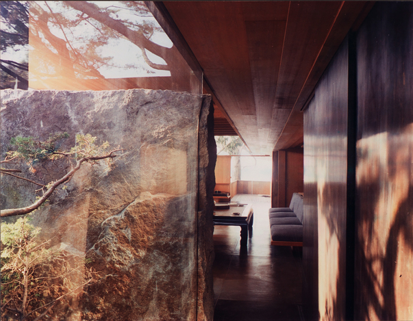
One of the most distinctive features of the house, beyond the diamond-sectioned trusses, is the solid 13 ton block of granite Hillmer chose himself from a quarry in the Sierra Mountains. Glass runs straight into a cut in the stone.

Here is another view of the fireplace, from the SF MoMa's collection:

Even better than the sheer uninterrupted mass, and the wonderfully natural rough granite texture on the front of the stone, is the fact that it also serves as a wall, separating the living room from a two story courtyard built around a mature cypress tree. I can imagine walking down this hallway, peering through the glass that seamlessly merges into stone, and seeing a branch from the cypress tree brush against the granite in a light wind. This hallway would take me not from bedroom to living room, but into the heart of the Sierra Nevada mountains.
There has been increasing interest in Hillmer, including a recent spread in the Wall Street Journal about a nicely restored Hillmer house in Napa, the Munger House. The Munger house was built by its original owner, and never fully completed. MAP (Metropolitan Architecture Practice) stepped in to complete the house, along with subtle interventions to improve the flow of space as well as other needed upgrades, and now identifies the house as the Telesis house. The SF MoMa also decided to publicly post images of its archive of Hillmer materials, including the wood model shown below.
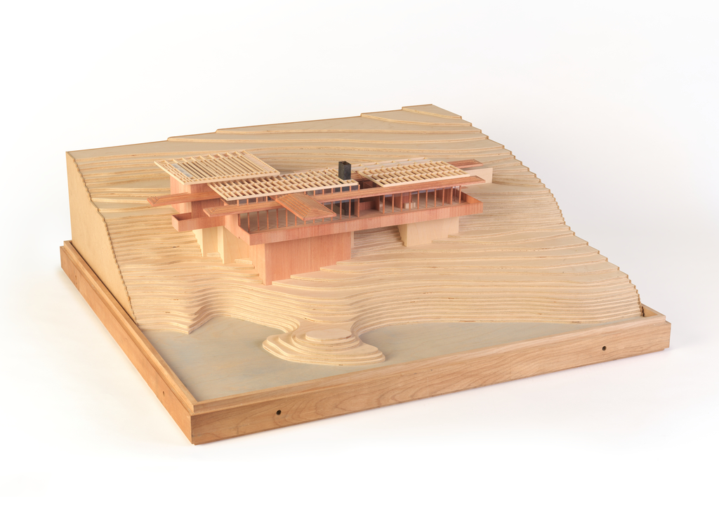
SF MoMa's scale model of the Leudekens House
I also found a great post on savewright.org that featured pictures of the Ludekens House from the April 1951 issue of Architectural Forum.
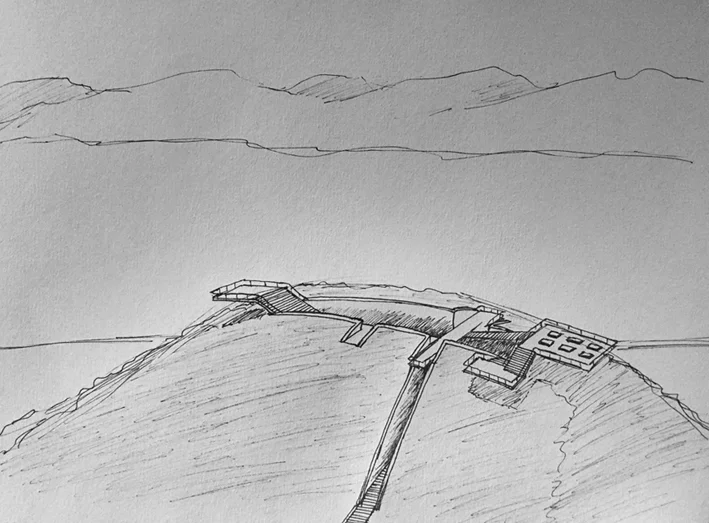
Although he only designed 10 houses, and never became well-known, I agree with Hess that "Hillmer is one of the most original architects produced by California." Each of his 10 houses are cataloged below, and I find at least half of them stunning. Like Wright, Hillmer experimented with different geometries, such as the hexagon and spiral.
1) Hillmer / Calister Office - 425 Bush Street Penthouse (1947)
2) Hall House - Kentfield (1947)
3) Ludekens House - Tiburon (1950)
4) Munger House - Napa (1953)
5) Hall House - 405 Goodhill Road, Kenfield (1950)
6) Barnes House Addition - Palo Alto (1959)
7) Stebbins House - Kent Woodlands (1960)
8) John C. and Patti Wright House - Inverness (1962)
9) Dominic Cagliostro House - 49 Vicente Road, Berkeley (1977/1993)
10) Dr. Poor House - Berkeley (1996)